


Who are you?
What industry do you work in?

Jawnt's Dashboard makes it easy for benefits admins to track enrollment, measure program performance, and demonstrate ROI, all in one central place.

.png)
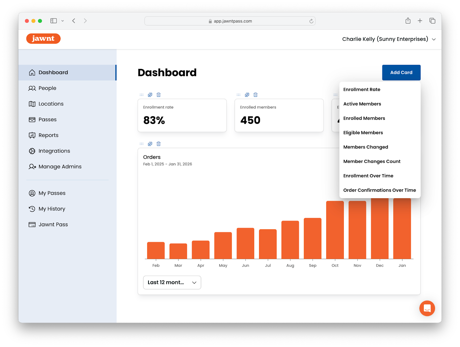
We're excited to introduce the Dashboard: a powerful new way to measure your commuter benefits insights. View key program metrics at a glance—including enrollment rate, active members, eligible members, order confirmations over time, and more—right from the Jawnt platform.
Previously, understanding your commuter benefits often meant requesting reports or hunting through multiple systems and matching up data manually. Now, all the information you need is available in one central place.
Read on to learn more about this powerful tool and how you can use it to demonstrate the value of your commuter benefits program.
Running a commuter benefits program is one thing, knowing whether it's delivering value is another. We wanted to make this as easy as possible for program administrators, whether you’re a benefits admin, HR leader, or transportation manager at your organization.
When onboarding new organizations at Jawnt, we work with stakeholders to understand their reporting needs and build any custom, on-demand reports. After working with organizations of all sizes in all industries, we found that several key performance indicators (or KPIs) were requested most often, in varying intervals. Monthly or weekly reports are great, but why not have access to this data all the time?
By having these data points readily on hand, Jawnt Admins can:
So, what metrics can you look at to know if your commuter benefits program is working? Read on to learn how Jawnt can help answer this question.
If you're an Admin, you can choose which information to display on your Dashboard from the following options:
Each metric is displayed on its own card on the Dashboard, making it easy to scan the information most relevant to you.
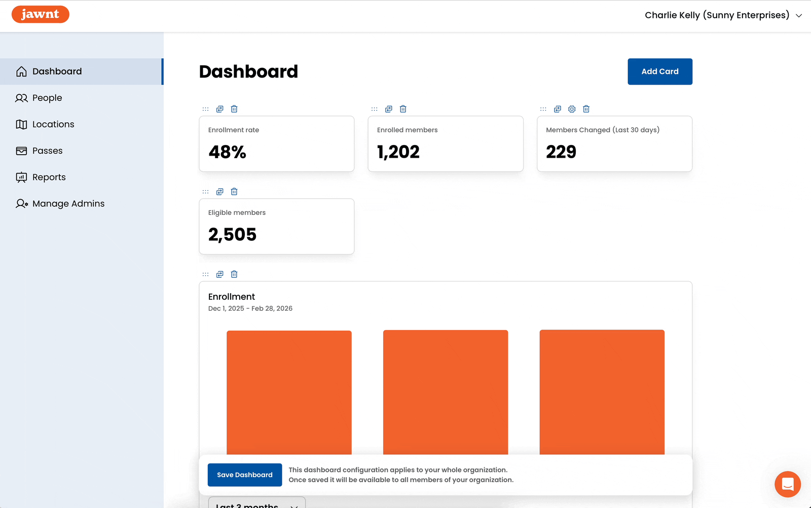
Your Dashboard is fully customizable, so you can focus on the metrics that matter most to your organization. Add, remove, or reorder cards to create the layout you want; once you save your configuration, it will be applied across your entire organization so all Admins see a consistent view.
Want to customize your Dashboard throughout the year for monthly check-ins, quarterly business reviews (QBRs), or annual evaluations? Making changes is easy.
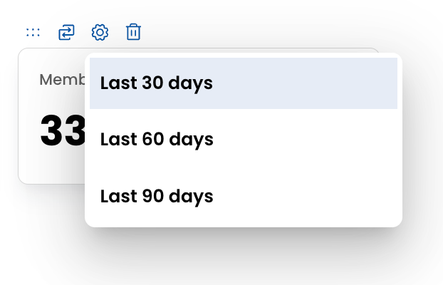
To visualize trends in Enrollment Over Time and Order Confirmation Over Time, you can toggle the timeframe to show the past 1, 3, or 12 months depending on how much historical context you need. When looking at member changes, you can choose to view data from the past 30, 60, or 90 days.
Whether you're doing a quick weekly check-in or a deeper quarterly review, the Dashboard can flex to fit the way your team works.
The new Dashboard is just one way Jawnt helps organizations better understand and manage their commuter benefits programs. We’re looking forward to building upon these tools to give administrators even more visibility into how their programs are performing. By making key data easier to access and act on, we hope to help teams spend less time pulling reports and more time delivering meaningful benefits to their employees.
What would you like to be able to measure from your commuter benefits platform? Send us your ideas at hello@jawntpass.com or schedule time for a demo.


.png)
